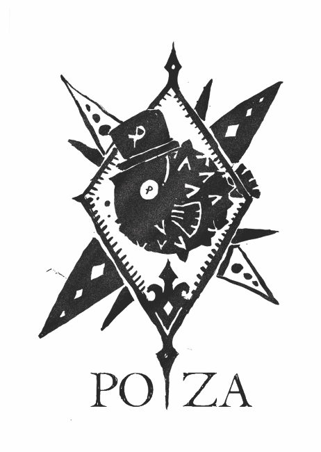
As part of Camp Hydro, (TP Design Orientation Camp 14/15), Poiza is one of the five empires in a theme that synthesises underwater and steampunk aesthetics. Poiza brandishes a striking orange as part of its' identity, representing the pufferfish. This illustration is produced as the main graphic for a t-shirt, using elements such as spikes, as well as replacing the default circular body with angular jabs.